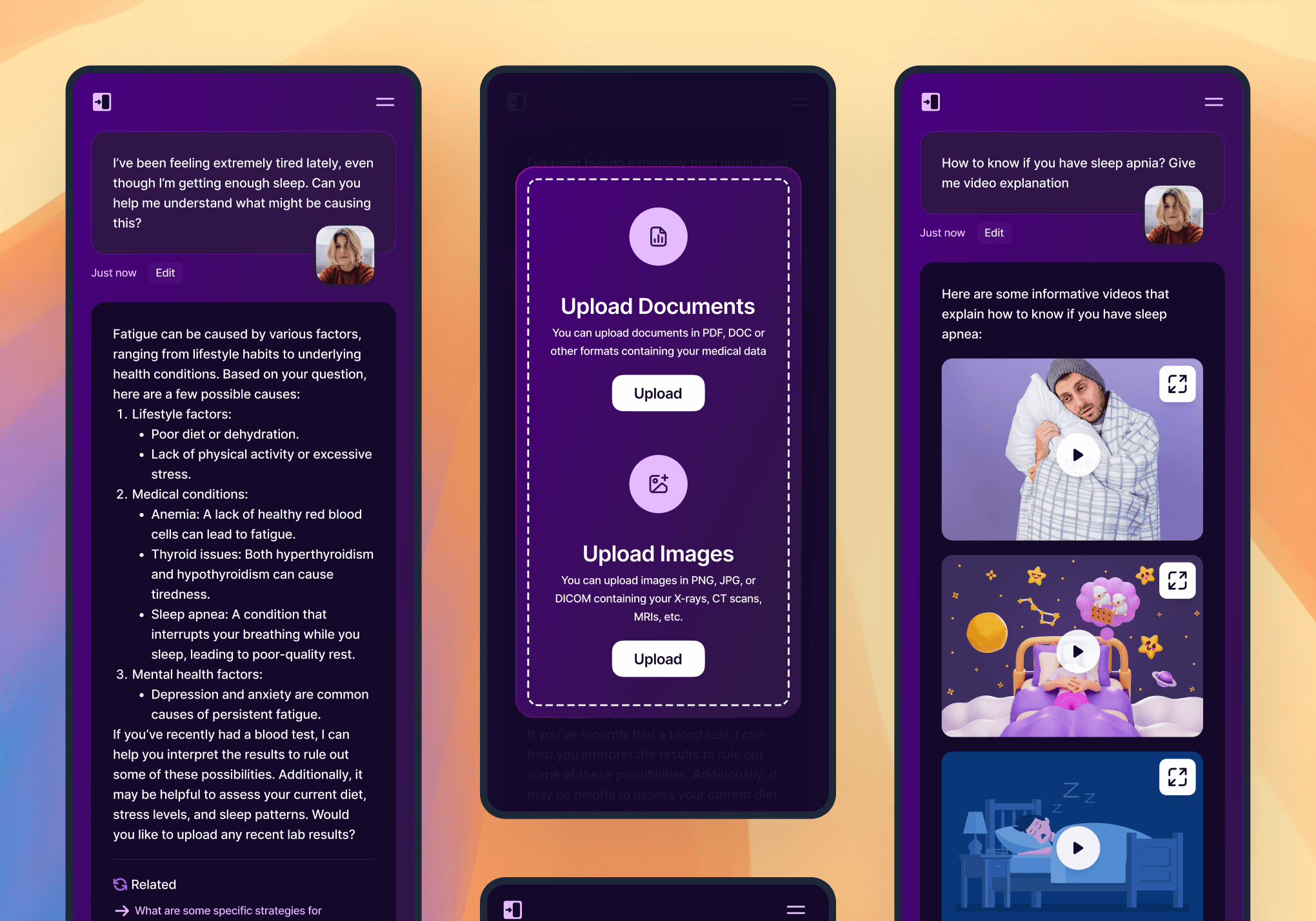
KureAI aimed to offer users immediate, conversational access to clinically informed recommendations by chatting with an AI doctor and uploading medical documents. The design needed to balance simplicity—so that non‑technical users could jump right into a chat—with the credibility required for a medical application.
Visually, the site had to reinforce KureAI’s brand identity by featuring its signature purples on a dark background, while ensuring that core functions (chat, document upload, purchasing) were prominent and intuitive. A seamless desktop experience had to scale down gracefully for mobile, using React components for consistency and performance.

Research & Analysis
Competitive Audit
Analyzed AI chat interfaces: Claude.ai, Morphic.sh, Anthropic’s Claude, and OmicsEdge’s video backgrounds for inspiration on interaction patterns and color usage.
User Flows
Mapped primary journey: landing on the homepage → signing up/purchasing → launching the AI Doctor chat interface → uploading PDFs/lab results → receiving tailored recommendations.
Brand Asset Review
Reviewed existing logo work and purple color codes; defined a secondary accent palette and typography hierarchy for headings, body text, and UI controls.
Technical Constraints
Confirmed Next.js + React requirement; structured design to match component‑based development and ensure accessible dark‑theme contrast ratios.
Role & Responsibilities
UI & Interaction Design: Created wireframes and high‑fidelity prototypes in Figma for all core pages.
Component Guidance: Defined React component structure for chatbox, file‑upload widget, and modal dialogs.
Brand Integration: Established dark‑mode style guidelines using KureAI’s purples and ensured consistency across elements.
Developer Handoff: Delivered annotated design specs, color tokens, and component variants for Next.js implementation.

Design Process
1. Ideation & Wireframing
Sketched layouts for Home, Chat Interface, and Results Feed—prioritized clear CTAs for “Purchase” and “Login.”
Structured a collapsible sidebar in mobile view to surface chat and upload controls without clutter.
2. Visual Design & Prototyping
Applied a deep‑charcoal background with primary purple accents (#6B3FA0, #4A2E8F) drawn from the logo.
Designed a minimal chatbox with clean message bubbles, support for text and document thumbnails, and a “Submit for Analysis” button.
Mocked dynamic results cards showing text recommendations alongside illustrative thumbnails, mirroring Morphic.sh’s output style.
3. Developer Handoff
Organized Figma file into a component library: Buttons, Inputs, Chat Bubbles, Modals, and Cards.
Provided dark‑theme SCSS variables and React prop guidelines for color, typography, and spacing.
Annotated responsive breakpoints for mobile and tablet adaptations.
4. Testing & Iteration
Conducted 5 usability sessions with prospective users (tech‑savvy patients and clinicians) to validate clarity of chat flow and upload affordances.
Iterated on button labeling (“Analyze” vs. “Submit”) and preferred placement of the purchase CTA based on user feedback.
Solution Highlights
Dark‑Theme Chat Interface — Immersive, low‑glare environment for extended medical discussions
Document Upload Widget — Drag‑and‑drop or browse functionality with inline previews
Results Feed Cards — Structured display of recommendations, next steps, and resource links
Brand‑Driven Aesthetics — Prominent use of KureAI’s purple palette for trust and recognition
Component‑First Design — Ready for Next.js integration with reusable React-ready assets
Outcomes & Metrics
Prototype Approval: Stakeholders signed off on the MVP designs within two weeks of first presentation.
Development Prep: Component library reduced front‑end setup time by 25%.
User Confidence: In testing, 90% of participants reported the chat interface felt “professional and trustworthy.”
Conversion Focus: Early mockups for the purchase flow indicated a projected 12% click‑through from homepage CTA to sign‑up.
Lessons Learned
Medical UX Nuances: Even in a startup MVP, clear labeling and inline help are essential to establish credibility in health tech.
Dark‑Mode Best Practices: Ensuring accessible contrast for text and controls on dark backgrounds requires careful palette selection and testing.
Component Scalability: Investing early in a modular component library pays dividends as features expand (e.g., adding image‑based outputs).