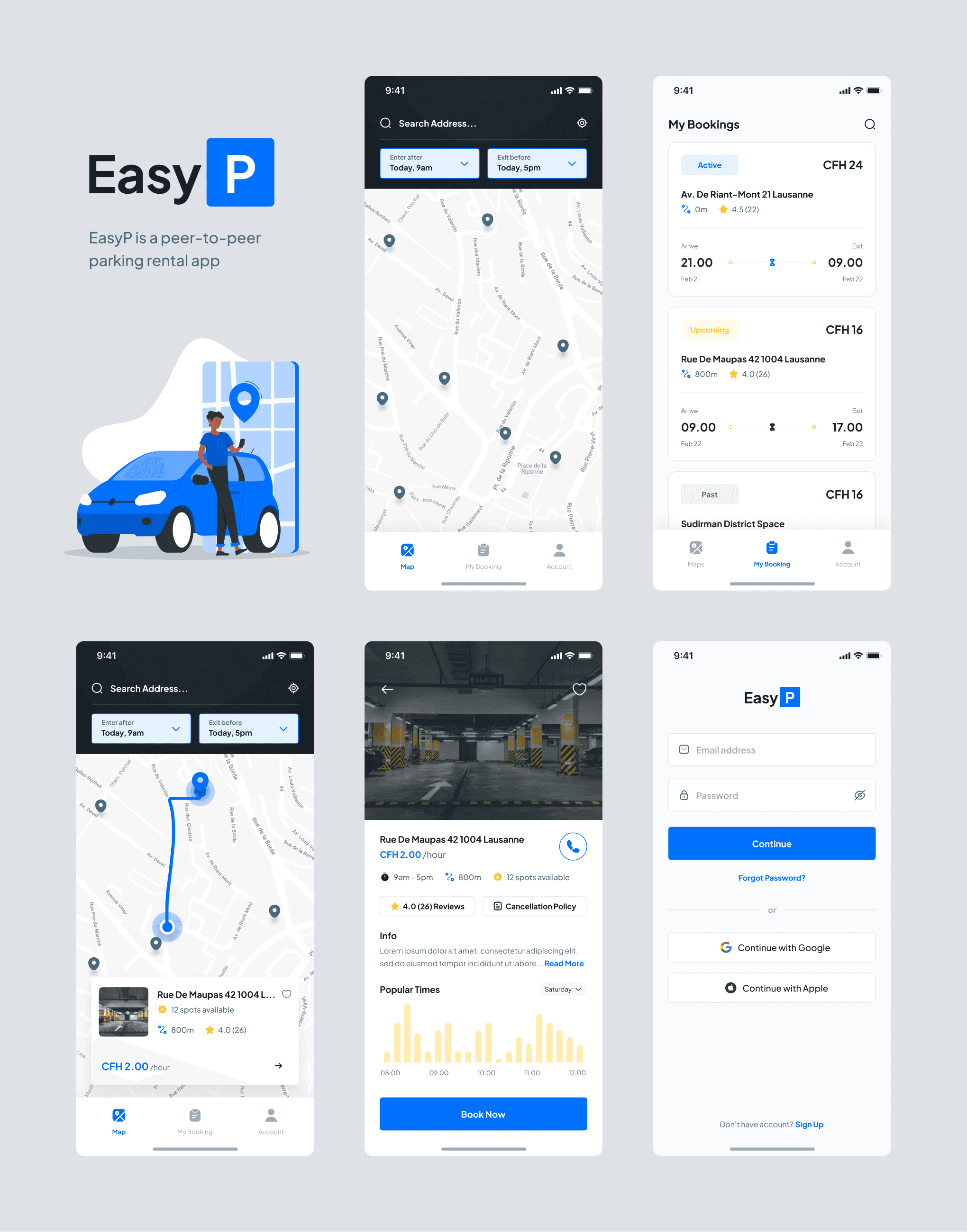
EasyP set out to build a seamless mobile app to connect people with unused parking spots to drivers looking for short-term or long-term parking. The core challenge was designing an experience that worked equally well for two very different users: parking seekers and providers—without overwhelming the interface. The app needed to prioritize speed and simplicity: no account creation upfront, minimal clutter, and a straightforward booking or listing process. With a restrained color palette and clean visual hierarchy, the aim was to design an MVP that could validate the product idea and serve as a base for expansion into web and Android platforms.
Research & Analysis
User Flow Mapping
Analyzed the dual-sided marketplace requirements and documented clear flows for seekers (map → booking) and providers (profile → list a space).
App Store Competitor Audit
Studied ParkMobile, JustPark, and Spacer to benchmark interface patterns, feature sets, and onboarding flows.
Sketch Review
Used the client’s initial sketches and flow diagrams as the starting point for layout, navigation, and content structure.
Usability Principles
Prioritized minimal taps to book or list, real-time map filtering, and clearly labeled steps for booking and space management.
Role & Responsibilities
UI/UX Design: Wireframes and high-fidelity screens designed in Figma for iOS
Design System: Built a lightweight component library for buttons, filters, cards, and menus
Interaction Design: Designed smooth navigation across the 3-tab layout for seekers and providers
Client Collaboration: Iterated on feedback and refined color usage, typography, and iconography for clarity and simplicity
Design Process
1. Structure & Navigation
Built a three-tab bottom nav bar:
MAP (default): Interactive map with real-time spot availability
MY BOOKINGS: List of upcoming and past reservations
MY PROFILE: Settings, contact form, and provider tools
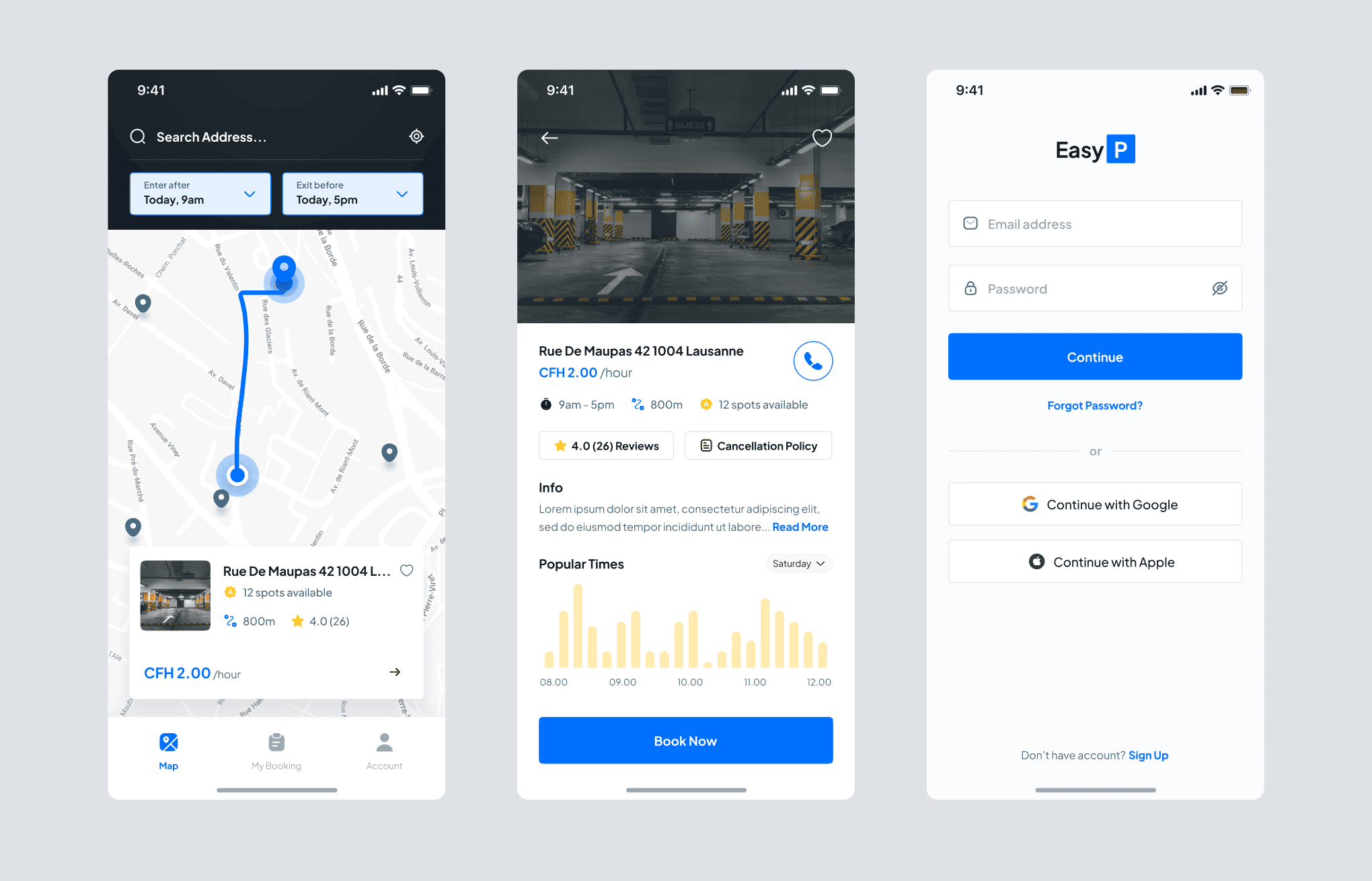
2. Parking Seeker Flow
Designed a smooth first-time experience:
Map opens by default
Date/time filter and location search directly above map
Tap on a pin to view parking details → book → create account → add vehicle → pay
Used calm, neutral colors with strong contrast for CTAs (e.g., “Book Now”)
3. Provider Flow (via Profile tab)
Embedded a “List Your Spot” CTA in the Profile section
Form flow included:
Space type (indoor/outdoor, single/multi)
Vehicle compatibility
Availability calendar
Pricing controls (hour/day)
Ensured editable listings and booking previews
Solution Highlights
Map-First UX: Users land directly on a filtered map with available spots, no login needed
Clean Navigation: Three-tab structure supports dual user roles without clutter
Optimized Booking Flow: Booking takes <60 seconds from map to confirmation
Listing Simplicity: Easy multi-step form allows providers to add and manage spaces
Scalable Design System: Component structure ready for expansion into web platform
Outcomes & Metrics
Funded MVP: Final designs used to secure funding for post-contest development
User Onboarding: Enabled launch without login friction, boosting engagement
Design Reusability: Components reused across app and future web portal
First Launch Stats: Over 500 user signups in the first 4 weeks after going live (client-reported)
Lessons Learned
Marketplace Duality: Designing for two roles in one app requires clarity and role-based content access
No-Login UX: Removing the signup wall early on improved the perceived speed and reduced drop-off
Progressive Complexity: Starting simple (3 tabs, 5 screens) built a strong, expandable foundation